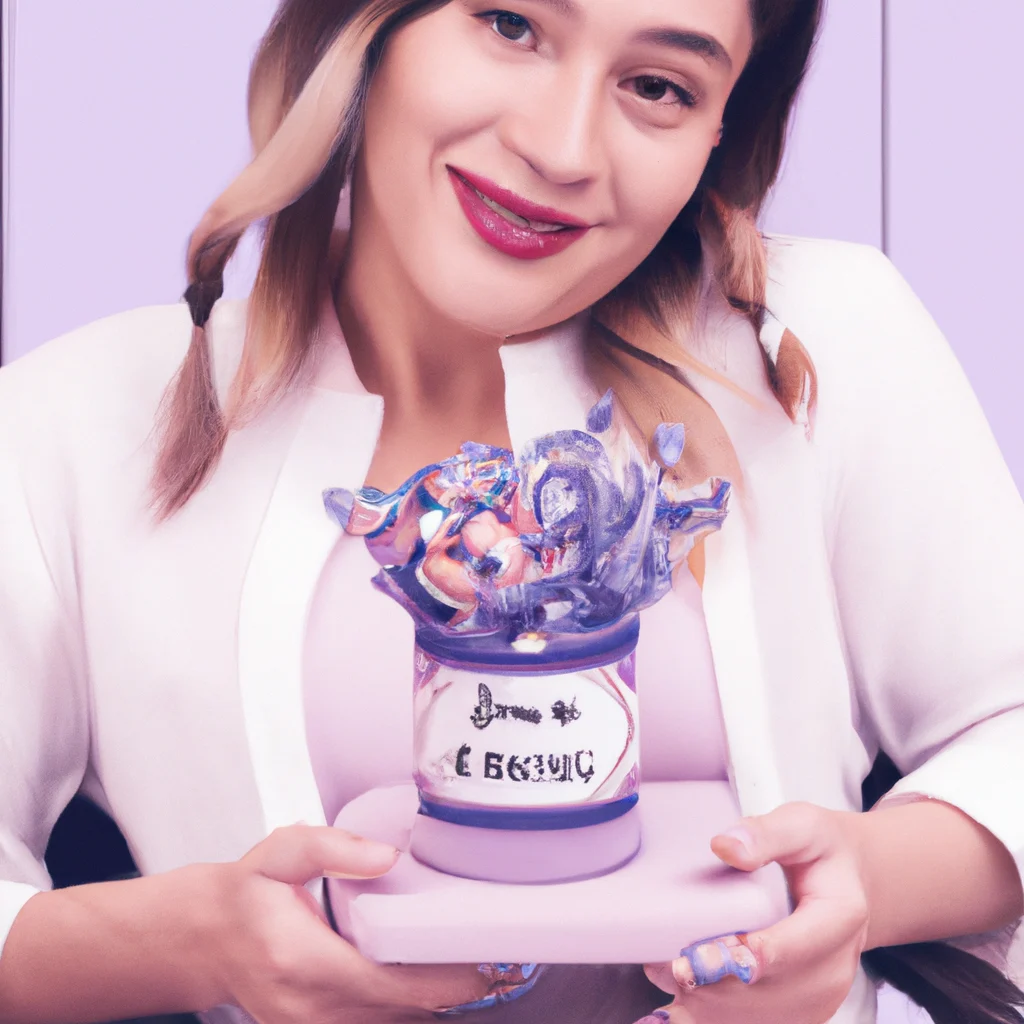
The color pastel lavender has made significant strides in the world of design, fashion, and interior decor, establishing itself as a dominant presence in the year’s color palette. This article will explore the journey of pastel lavender, from its historical significance to its contemporary applications, and why it has been chosen as the color of the year.
Historical Significance of Lavender
Lavender, a hue that balances between blue and purple, has been appreciated throughout history for its calming qualities. In ancient cultures, this color was often associated with tranquility and femininity. The use of lavender dye dates back to the Roman Empire, where it was prized for its soothing properties and was used in baths for relaxation. Over centuries, lavender has been a symbol of elegance and refinement, often utilized in royal attires and lavish decorations.
The Psychological Impact of Pastel Lavender
Colors have profound effects on human psychology, and pastel lavender is no exception. Studies indicate that shades of purple can evoke feelings of calmness and serenity. This particular shade, being softer and less intense than traditional purple, provides a gentle reminder of nature and tranquility. Interior designers frequently incorporate pastel lavender into spaces meant for relaxation and rejuvenation, such as bedrooms and wellness centers.
Pastel Lavender in Fashion Trends
The rise of pastel lavender in fashion is a reflection of broader trends towards lighter, softer colors that evoke comfort. Designers have integrated this shade into seasonal collections, showcasing its versatility across different styles. Pastel lavender can be paired with neutral tones for a sophisticated look or combined with bolder hues for a more playful aesthetic. The color has been spotted on runways, influencing street style and high-end fashion alike.
Runway Highlights
Fashion weeks around the globe have seen pastel lavender prominently featured on the catwalks. Renowned designers utilize this color to create visually striking collections that appeal to contemporary sensibilities. The color’s ability to transcend seasons makes it a staple in both spring and fall collections, celebrated for its adaptability.
Interior Design Trends Featuring Pastel Lavender
Within interior design, pastel lavender has gained traction in recent years as homeowners and designers seek to create calm and inviting spaces. This color can be used effectively in various applications, from wall paint to upholstery and accents. The soft nature of pastel lavender allows it to harmonize with other colors, making it an ideal choice for creating cohesive designs.
Color Pairing Strategies
When incorporating pastel lavender into interior spaces, pairing it with complementary colors enhances its appeal. Soft greens, muted pinks, and light grays work beautifully alongside lavender, creating a serene environment that promotes relaxation. Additionally, metallic accents, such as gold or silver, can add a touch of elegance to a pastel lavender-themed room.
Pastel Lavender in Branding and Marketing
From a branding perspective, pastel lavender has become a popular choice for companies aiming to convey a sense of calm and trustworthiness. Brands in the wellness and beauty sectors often utilize this color to align their products with feelings of peace and serenity. As consumers increasingly seek products that enhance their well-being, the strategic use of pastel lavender in branding can create a strong emotional connection.
Environmental and Cultural Influences
The resurgence of pastel lavender can also be linked to cultural movements advocating for mental health awareness and mindfulness. As society becomes more conscious of the importance of mental well-being, colors that promote relaxation are increasingly favored. Pastel lavender’s gentle tone aligns perfectly with this shift, making it a fitting choice for 2023.
Pastel Lavender: A Symbol of Hope
In the context of recent global events, pastel lavender has emerged as a symbol of hope and renewal. As we navigate through challenging times, the soothing qualities of this color provide comfort and optimism. It serves as a reminder of the beauty of simplicity and the importance of self-care.
Implementing Pastel Lavender in Everyday Life
For those looking to incorporate pastel lavender into their lives, there are numerous practical applications. Home decor items such as throw pillows, blankets, and artwork can introduce this color into a space without overwhelming it. In fashion, accessories like scarves and handbags can serve as subtle yet impactful additions to an outfit.
The Future of Pastel Lavender
As we look ahead, pastel lavender is likely to remain a prominent color choice across various industries. Its versatility and appeal ensure that it will continue to be a favorite among designers and consumers alike. The ongoing appreciation for soft, calming colors suggests that pastel lavender will maintain its status well beyond this year.
Conclusion
In summary, pastel lavender has established itself as a significant color for 2023, drawing from its rich history, psychological benefits, and cultural relevance. Whether in fashion, interior design, or branding, its calming qualities resonate with a wide audience. As we continue to prioritize mental well-being and aesthetic beauty, pastel lavender will undoubtedly play a crucial role in our lives. For more inspiration on lifestyle choices that integrate color and well-being, visit Nivax Lifestyle.


